When owner Amber Eilers renovated and designed Strawberry’s The Strawberry Inn – formerly the Windmill Corner Inn – in the summer of 2016, she kept functionality in mind. In addition to the main building on AZ-87, cabins were added to the property in the summer of 2020 on Fossil Creek Road. The cabins resemble small homes and will be the focal point of this design feature. “Functionality is huge. How we’re going to use this space? And then trying to think of how to make that experience the best it can be?” says Amber. “My plan for the space was to create a light, bright, welcoming environment with high-end finishes.” She tells us that furniture placement is key when designing a smaller space.
Amber recommends using a mostly neutral color palette when designing the main parts of a home for a timeless, classic look. Small accessories like throw pillows and art prints can be swapped out to periodically refresh a space.
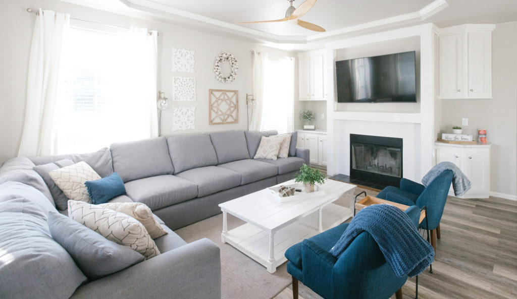
“I love design that has an end result of looking very simple and effortless,” says Amber. “In The Guest House cabin, I arranged the great room to allow for maximum flow between the spaces. We have a huge sectional sofa in the family room that anchors that space, an eight-seat dining room table and a big kitchen, but it still feels really wide open. I took advantage of the wall space in the family room to accommodate the big sofa, and I find that works really well in a lot of smaller spaces to keep the room open.” Another one of her design solutions was keeping her color palette mostly neutral to extend the longevity of the look. “If you’re designing, using bright paint is really helpful to help create a clean and classic look,” says Amber. “You can always change out décor like soft goods or art prints or small decor items. Keep the main bones neutral.”
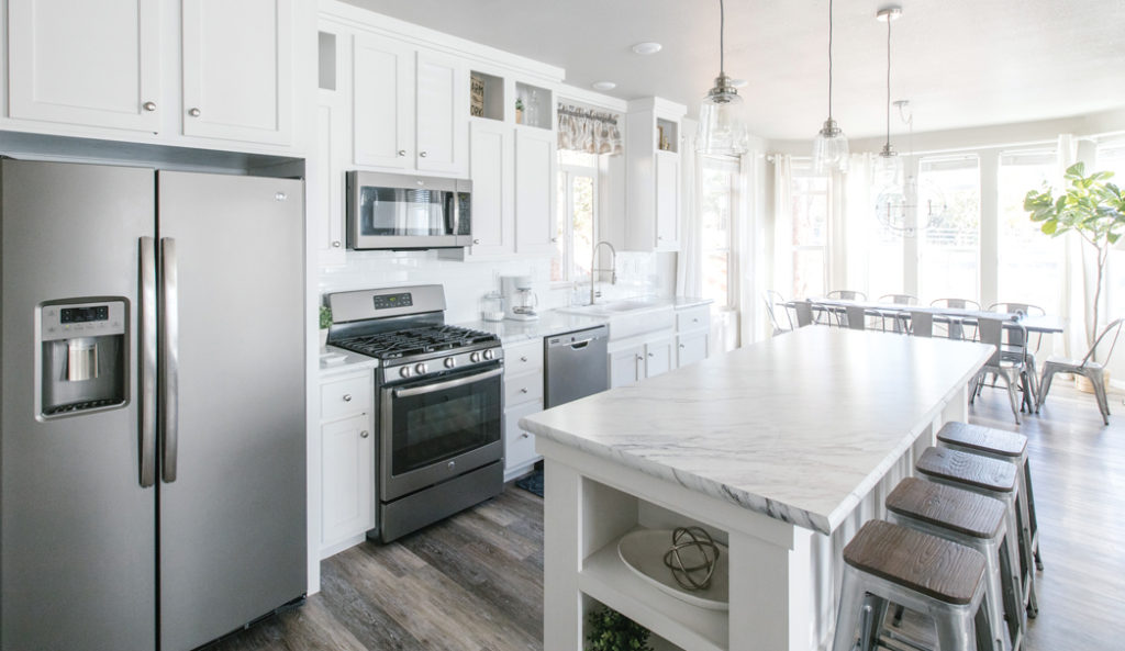
In the kitchens, Amber used open-shelving to keep the cottages feeling open and spacious. She also wanted to keep everything out in the open so guests would be less likely to leave anything behind.
The hotel’s setting in the woods is another factor Amber considered. “We’re just located in a place where the trees and the mountains and the natural scenery is so beautiful. And I don’t think the inside has to be too fussy,” she says. “We want the styling to be appropriate … We want to be really seamless inside and out.” To capture this feeling, Amber replaced the light pale carpet in the inn with a tile floor resembling wood on the floors of the rooms. “That obviously matches the decor of being in the pine trees. But it’s also super functional for our hotel because we can keep it much cleaner,” says Amber, of the tile floors. No fear is another design approach Amber takes. For instance, she used fixtures with nickel, gold and black matte finishes throughout the rooms. “Don’t be afraid to mix it up. Just be intentional about whatever you’re doing,” she says. The cabins were originally all wood, but she wanted to change this. “Don’t be afraid to paint the wood white,” says Amber. “There’s a ton of wood outside.”
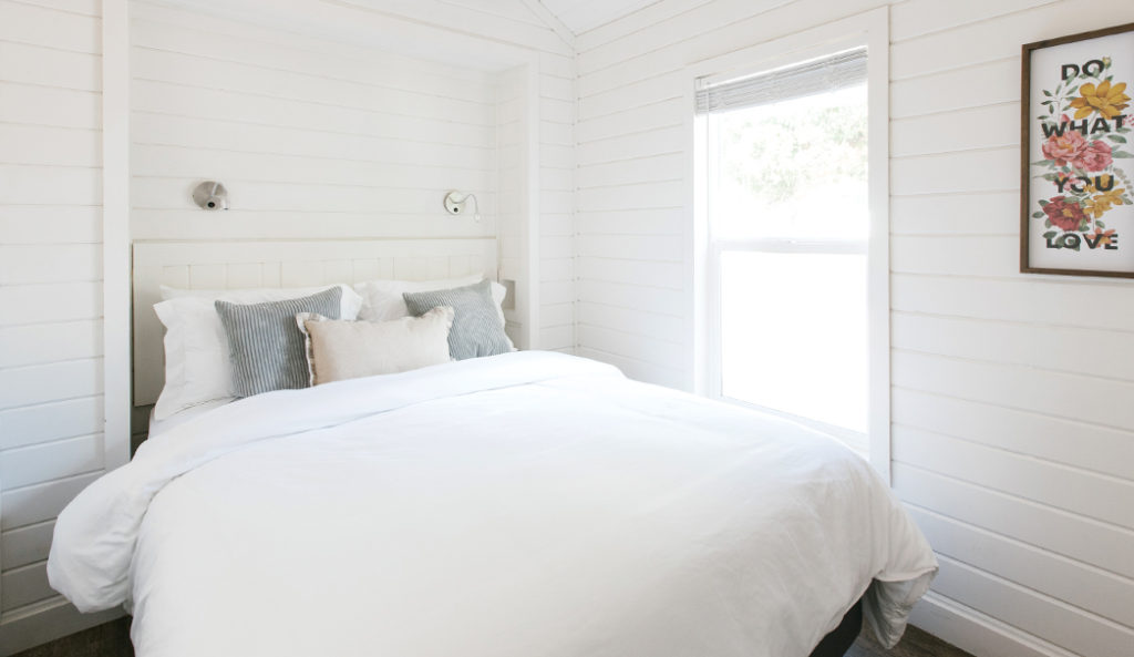
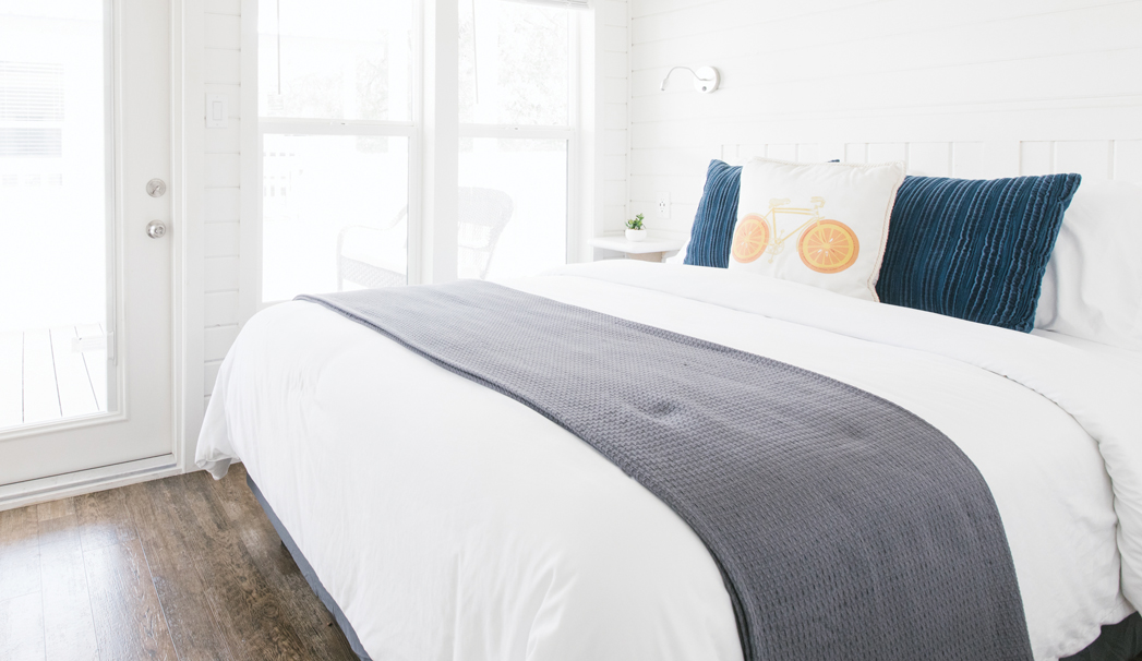
Amber employed many space-saving design techniques throughout. She added items like open shelving and sconces above the beds to give guests more space in their rooms. She used white paint, in part, to help complement the bright light in Rim Country. Seeing as the inn is located in such a scenic part of Arizona, she says she felt like the design should be simple.
If you’re struggling with placing furniture in a room, Amber says she’ll tape out the floor where she planned to place the couch. She’d check out the view from that spot and then see if how it felt to navigate the room. She wanted to ensure that furniture was easy to get around, not too big and placed in a way that offered guests beautiful views when they were sitting on the couches. “Having furniture that’s the right scale to the property is really important,” says Amber. When it comes to placing furniture, she employs certain techniques to make the most out of a small space. “In the bedrooms, I usually put the head of the bed up against the wall that’s away from the door. I love the statement it makes when you walk into a room, no matter the size. It makes it feel so much bigger too,” she says.
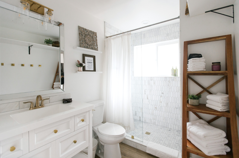
Amber used white as a dominant color throughout The Strawberry Inn. She outfitted the bathrooms with white tile, towels and linens. She used white to not only convey cleanliness but also make the cabins feel “fresh and luxurious.” She also mixed metals like gold and black matte, which you can see in the faucet, vanity knobs and shelf brackets in the photo above. She recommends using a dark grout in a bathroom so, in her words, “you’re not fighting a losing battle.”
The bathrooms, like the bedrooms, were mostly done in white tile to convey cleanliness. “Pick dark grout in the bathroom,” she says. “It’s a nice contrast. Over time, grout can discolor And so if you start with a dark color grout, you’re not going to be fighting a losing battle.” History was another factor when she designed the inn. The hotel was originally built in the 1970s as office suites. “We wanted to honor the original structure while still bringing it up to date and making it safe,” says Amber. The property contained charming architectural details that were somewhat hidden. Amber kept items like the actual windmill in front of the main building, original doors with a diamond pattern in the glass and custom railings. Colors were another factor too. Overall, Amber chose the color scheme of red and white. She added fresh red paint to the doors to catch the attention of passing drivers and as a playful nod to the inn’s location in Strawberry. In addition to white paint inside rooms and cottages, the rooms are stocked with crisp white towels and linens to emphasize cleanliness.
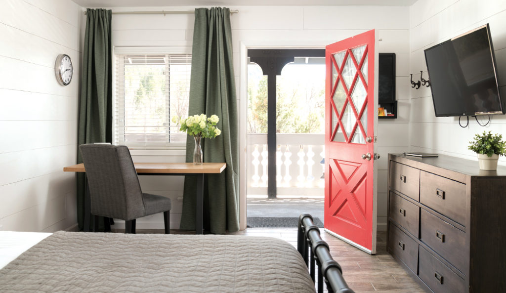
The primary color palette Amber used throughout the inn was red and white. She selected red both as a playful nod to the inn’s location in Strawberry and as a way to catch the attention of passing traffic.
“As far as the interior, everything’s bright white so that we can make sure that we’re keeping it clean and fresh. Makes it look light and airy. It doesn’t go out of style,” says Amber. “Having nice, clean white sheets, linens and towels looks really fresh and luxurious.” Many of the smaller cabins feature a small area for storage with hooks and open concept shelving so things are out in the open and easy for guests to access. Instead of traditional nightstands that sit on the floor, she used open shelves in part to save space. It also makes it harder for guests to forget or misplace their belongings. Wall-mounted sconces above the bed free up room on the surface of the nightstand. “We wanted everything out in the open, easy to grab, easy to find and navigate,” says Amber. “We try to be thoughtful about what things are really necessary.” She also focused on utilizing natural light. The property has blackout curtains, but they’re pulled back during the day to make the most out of the bright sunlight. Amber used white to help emphasize the light. “By painting it very white and just allowing all the natural light to come in so that property is so bright and airy,” says Amber. Design was a crucial part of renovating the inn. “It’s part of the whole experience for us,” she says, of the inn’s design. “It helps people feel comfortable and relaxed. When things are laid out in a way that makes sense, and it’s intuitive for them, I think that it helps us create a great place to vacation.”
If you know of any outstanding home renovation projects, home products or a local design project that might work for this feature, reach out to us at info@sedonamonthly.com. You must have high-res photos of the project.