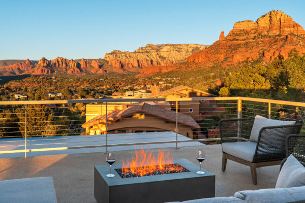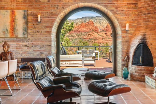
NEW HOME, MODERN AESTHETIC
When designers Lorie Harakal, Allied ASID, and Melissa VanDarien, of Sedona Soul Spaces were staging a home in the Village of Oak Creek to sell, they were keeping in mind the fact that most potential buyers would probably be looking at photos of the home on their smartphones. “Every room had to have a place that your eye would land on,” says Melissa. “In this house, we use both architecture and color and texture to give a buyer’s eye a place to land.”
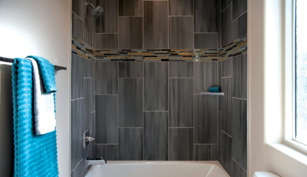
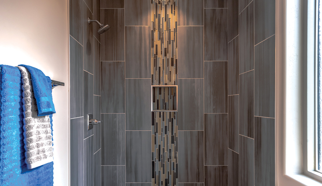
The bathroom with a tub featured a horizontal deco band along with blue towels and nickel fixtures.
The look was primarily contemporary featuring monochromatic gray with just a few splashes of color. The color palette was blue, brown, gray and taupe. Blue was chosen as an accent color in some of the home’s four bathrooms because there’s some blue in the porcelain tiles. “We have to put stuff in that’s going to make them stop and look. Now, in the bathroom, that’s a little trickier,” says Melissa. “The tile itself needs to able to stand up on its own and have an identity and an interest. So that’s why we use deco bands along with the field tiles that works with the floor tile, and it all comes together.” The duo used a vertical deco band in the bathroom that just featured a shower. In the bathroom with a tub, the designers went with a horizontal deco band to emphasize the tub. The glass deco bands – or the decorative “strips” that were used to break up the porcelain tiles on the wall – were put in place to give the rooms a focal point. “It breaks up this huge expanse of field tile or the tile that surrounds the shower,” says Melissa. “There’s a million different patterns that you can go with in terms of laying out the field tile. But a lot of times, it’s just what visually feels the most balanced and makes people happy.” One example of using color to draw attention to a specific spot in a room was placing a striking glass floating vanity on top of a piece of meteorite granite in a powder room.
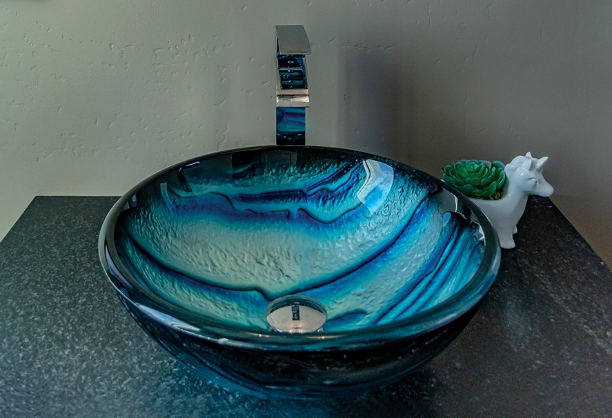
A striking glass blue vessel sink in a powder room. Blue was used as an accent color in some of the home’s four bathrooms.
“It needed something specular for the top of it. Otherwise, it starts to get a little boring,” says Melissa. The blue sink in the powder room was nearby the office that featured two blue velvet chairs to create continuity throughout the home. “That blue that you see in the powder room was pulled into the office. It creates a palette for the house that’s appealing without being overly bold,” says Melissa. “Each room can have its own identity. But if you have something that binds all the house together so that it feels cohesive, and that is more of a feeling than even a visual. You walk into a house, and it feels complete. It feels like it works everywhere you go and the things that you liked in one room are reflected in some other way in another room. It all feels like a cohesive space.”
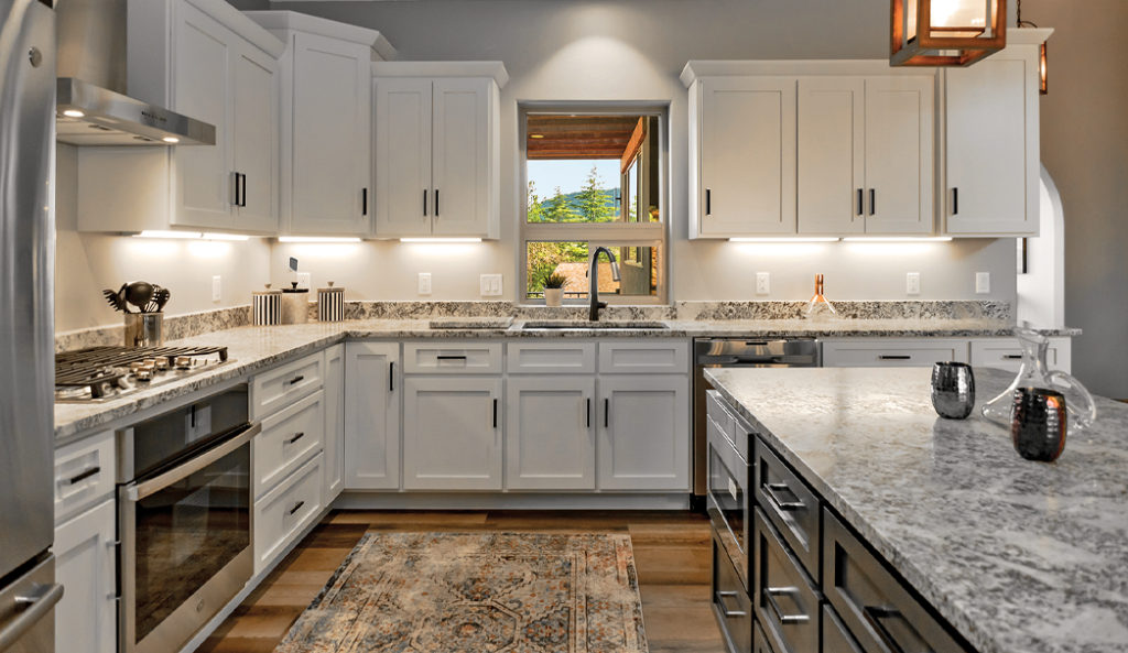
The kitchen was outfitted with satin granite countertops, raised cabinets of different heights to give the space a more open and airy feeling and black pulls and a faucet.
Another standout area of the home is the kitchen. “It’s also the heart of the house, and it’s visible from every area. So we had to make it pleasing in virtually every area that you looked at it,” says Melissa. “We wanted it to be very modern, simple, but really look very luxurious.” Just like with the bathroom, the designers had to answer this question: “How do you make it blend but also have its own really great identity?” The answer was all in the details like the color of the cabinets and light fixtures. In the kitchen, the original builder wanted satin granite countertops as opposed to polished ones for a “warmer” feeling. Sedona Soul Sisters added black matte fixtures with a bit of shine on the pulls. The faucet is also black. The different colored island was on-trend. “It’s very popular right now to have a different colored island, and the cabinets behind,” says Melissa, of the gray island.

The on-trend island was painted a different color (specifically Sherwin-Williams peppercorn) from the white cabinets. The wood and metal light fixtures hanging above the island were intended to bring out the red in the door and black in the fixtures. See if you can spot the microwave that’s part of the island.
“We went with the peppercorn color on the island as opposed to white. Believe me, we went through a lot of variations of white till’ we found the one that we thought was the right mixture. You don’t want to have it so discordant that it looks sharp. So it has to really blend together, and you’ll see that blend really comes together in the granite.” The cabinets are custom and don’t line up evenly by design. They’re raised to give the cabinets more personality and a more open, airy feel. The modern lighting
fixtures over the island are wood, metal and have a taste of Southwest rustic feel to them. The designers added upholstered saddle barstools because they can tuck under the bar and not disrupt the line of the island. The black in the hand pulls and faucets is brought out in the light fixture. Lighting was added under the cabinets for two reasons. “The thing about under-cabinet lighting is that it’s really kind of important for if you’re older. I’m older, so as I get older, I need a little more light. So that actually helps enormously with adding light,” says Melissa. “It has a beautiful look. When the house is dark, you can still put the lights on. It gives it a glow that is appealing.”
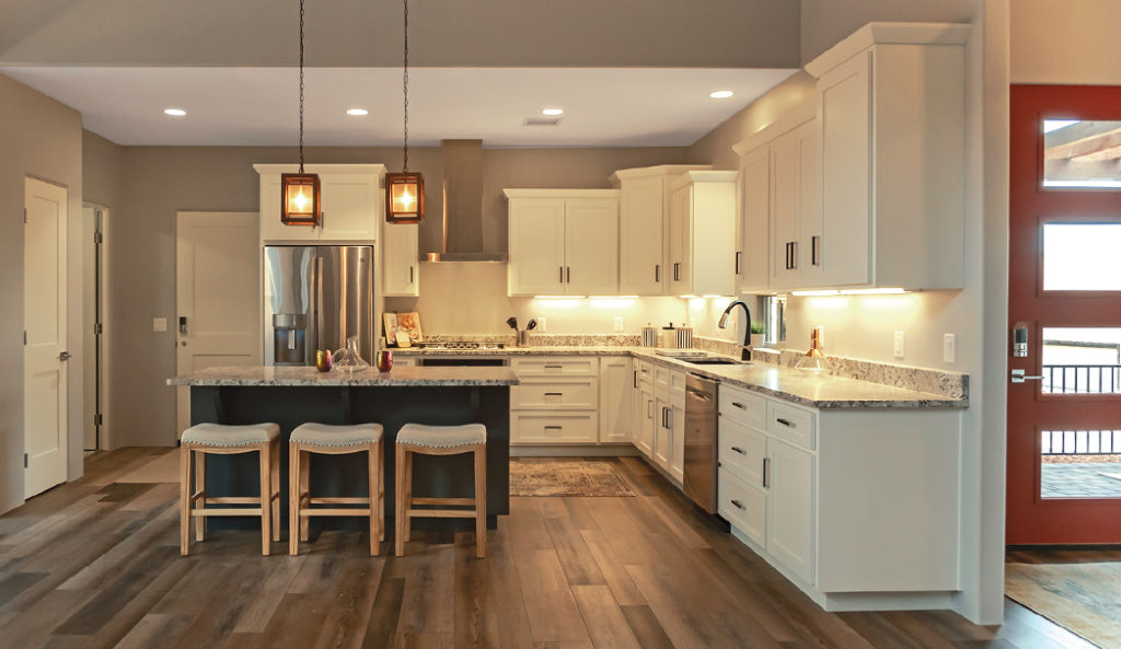
Sedona Soul Spaces accommodated the home builder’s request of wanting a red door. The pair chose a, in their words, “rich and creamy” red that blended in with the home.
The client also wanted a red door – a unique feature for the design team to work with. “So now we had to choose the right red. Not something garish or something that turns pink in the sun because that happens a lot here,” says Melissa. “But this color really had a richness and a creaminess to it that felt like it blended the house without being so sharp that it kind of shocks you when you walk in. It just feels good.” Overall, the team felt they brought warmth to the home. “We had a very beautiful palette to work with in terms of the actual structure itself. What we bought to this was the warmth that you need to feel in a home like this. If it was all gray, it would feel very cold and institutional. Any other palettes would not feel as yummy as this feels,” says Melissa. “It’s an emotional reaction you have walking through the house: this feels like I could live here.”