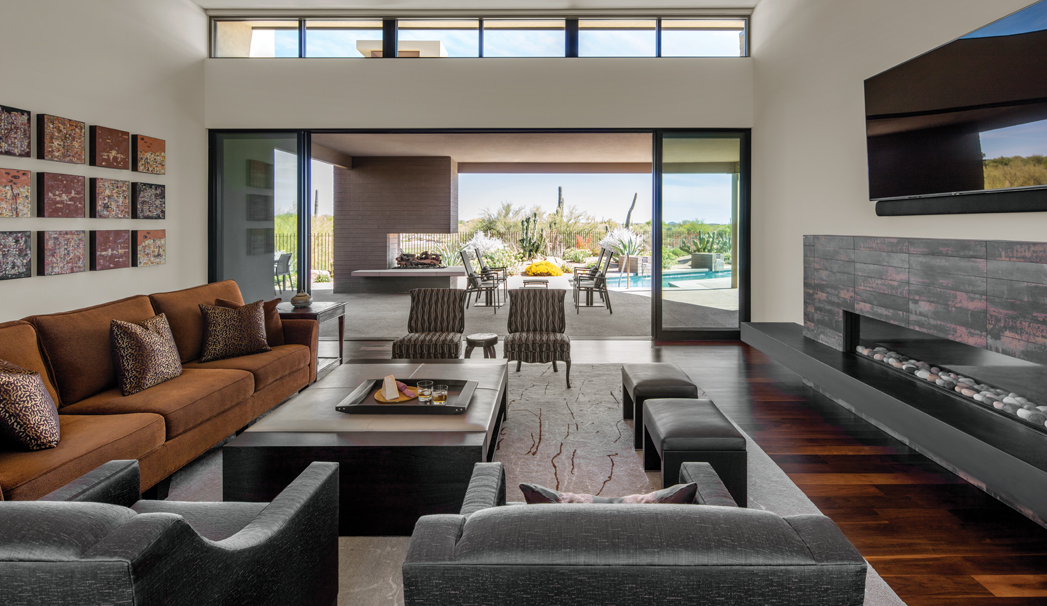
KT Tamm, principal and lead designer of KT Tamm Inc., had already been working with the owners of a home in Carefree – about 40 minutes from Phoenix – when the pair decided to build a brand new home in their same neighborhood. So KT got to work. She collaborated with Scottsdale-based architect David Dick and Joe Castello of Stonecreek Building Inc. to build the owners’ dream home. The Southwest contemporary house features three bedrooms, three-and-a-half baths and one home office. The home features 3,900-square feet of living space, and 1,100 square feet of outdoor living space. The owners brought a few pieces of their own furniture and contemporary art that KT needed to integrate into the overall design. The owners wanted mostly neutral colors with just accents of color. One way you can see this in the design? The coppery orange color that’s in most of the rooms. Copper is one of the “Five C’s” and is representative of Arizona – a key factor in ensuring the owners felt like they were in Arizona as opposed to their other home in Chicago. “Each space has its own sort of little attitude, but yet it all kind of flows together,” says KT.
Great Room
In the great room, the two chairs that are facing you in the photo and closest to the open door belonged to one of the clients’ family members. The client wanted to integrate the chairs into the space and that gave KT an item that she knew she had to incorporate into the design. “I was a little worried about the scale of them compared to the sofa, and the other new lounge chairs that we were bringing into the same space, but I think that we were able to pull it off pretty well,” says KT. “Never underestimate the power of a redo.” When KT designs a room, she typically starts from the ground up. She’ll begin with a furniture plan. Next, she’ll select hard surfaces and soft goods like area rugs, accent rugs and fabrics that will sit on top of those items. She used colors throughout to create continuity in a space. The sofa she selected is made out of a Donghia chenille called Mahogany that has a coppery finish that’s also found in paintings on the wall. “The intent here was to have some earthy accent colors, but not shocking colors,” she says. “You don’t want your interiors to be homogeneous. When you’re trying to have some warmth, but yet not jarring background in your soft goods, you add a little texture to it.”
Image above: The great room of a Carefree, Arizona, home designed by KT Tamm of KT Tamm Inc. She incorporated the owners’ original art and furniture into the overall design of this space in this contemporary and Southwest home. The owners wanted mostly neutral colors – like the sectional – with pops of color – like the pillows. “It allowed their art to really sing,” says KT.
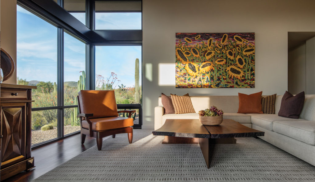
The coffee table of the family room was custom made and features a living edge. The orange chair and pillow add splashes of color.
Family Room
On the far left of this photo, you can see a console that a TV sits on top of. The owners had this piece beforehand, and it was folded into the design of the room. “We had to make sure that those new items complemented the heavier pieces. The console had some great carving detail to it, and I think that came out,” says KT. KT designed the sofa and picked the fabrics first. Next, KT created the custom coffee table. KT and craftsman Doug Forshe of De La Madera started searching for walnut veneers to craft the custom living edge coffee table. They found two pieces and “married” them together to make the top of the table. “The wood tones had to be complementary to the other wood tones that were there, but not identical. You don’t want everything, again, to be homogeneous,” says KT. “I wanted it to have its own personality and its own boldness.”
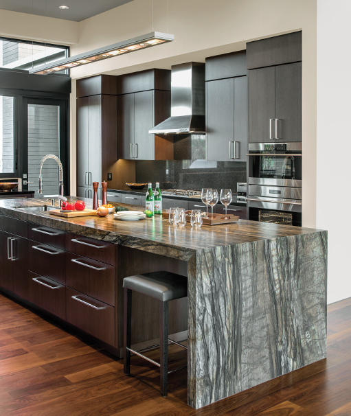
The kitchen of the home features a granite waterfall island that was ideal for the narrow space.
The Kitchen
“The kitchen itself is narrow and long. So space planning was interesting,” says KT. The granite island is the real star of the kitchen. It’s where the couple shares their meals and has ample storage space too. “The island had to have some uniqueness it needed to kind of make a statement,” says KT. “We went looking for something that had a lot of movement, had some texture to it.” The centerpiece is the lacquered granite countertop with a “waterfall” detail so the owners can slide barstools underneath the counter and enjoy their meals there. The granite is textured with a leathered finish, giving the piece a texture you can feel and would stand out amongst the dark brown cabinetry. “We needed the island itself to really sing so it wouldn’t get lost with the cabinetry on either side,” says KT. “A kitchen is only as good as it works. You want your kitchen to be as smart as it looks.”
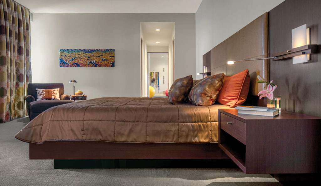
The master bedroom has a minimalist design.
Master Bedroom
To fit in with the overall flow of the home, the master bedroom has plenty of bold colors throughout. “All of that was just a continuation of the overall palette. We went a little bit stronger on the drapery simply because it was a great place to do that,” says KT. The master bedroom was designed to be clutter-free and mostly simple. The nightstands are built into the wall instead of separate pieces for what KT calls a “cleaner” look. Light fixtures were then inserted into the nightstands as reading lights. The drape track was integrated into the ceiling and remains unseen when the drapery is pulled back. This was done to match the room’s minimalistic feeling. The room only features necessary furniture. The reading chair in the corner gave KT’s client the ability to both read and admire his home’s beautiful views. “It’s taking advantage of the views and that you have many opportunities within that home to appreciate and enjoy,” says KT. “It’s a restful space.”
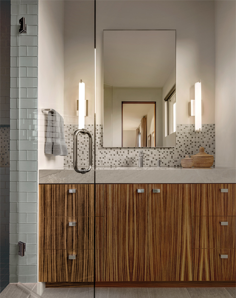
The guest bathroom features striking wood Sapele cabinets.
Guest Bathroom
The standout design feature of this guest bathroom is the Sapele wood cabinets that anchor the space. KT started with the cabinetry of this “small, but mighty space.” “This is a continuation of texture,” she says “The graining of the wood, which is pretty figurative, gives you that visual texture. It gives you that excitement. When everything else around it is pretty neutral, bring the texture. Textures, for me, should not just be limited to tactile, but I think it should also be something that you see.” Tile runs above the vanity and continues into the white-tiled shower. The continuity is important. “When you’re working with small spaces, sometimes less is more,” says KT. “We don’t have to have something new everywhere to make the most impact.”
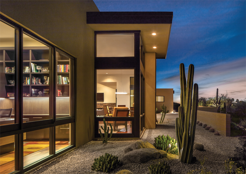
An exterior shot of the home. The house featured many desert vistas that were incorporated into the overall design.
Views and Design
This exterior shot showcases the family room and study but also shows off an important design element KT had to consider when designing each room – the vibrant desert views. “How can you arrange the furniture so that you’re capturing the views as well as other elements of the room? So there’s a lot that goes into the space planning early on. So it’s understanding the views that are integrated into any space,” says KT. Above all, when she’s designing a home, KT strives to make the owners feel right at home. “You want to make sure that you create a space for them that always makes them feel this was the right choice,” says KT. “‘I love coming here,’ and that home is one of the big reasons why they want to come here.”

