Photo 2
A Modern, Contemporary Addition To A West Sedona Space
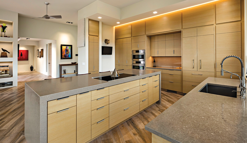
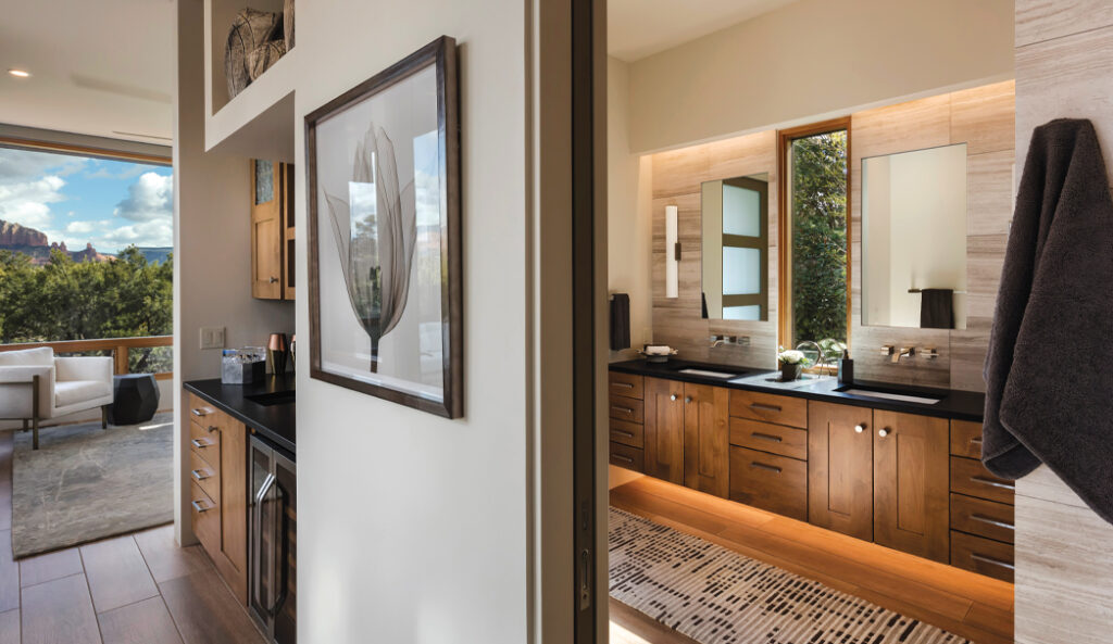
The featured floating double vanity in photo two and on the cover was an addition to a primary bedroom to a home in West Sedona. Down the hall is a closet and a water closet is nearby. The cabinets were a soft contemporary style and constructed out of clear alder wood that was lightly distressed, stained and glazed with a lacquer finish. Alder wood was chosen largely “to pull in tones from our flooring. A lot of times, we are either pulling in a tone on the flooring or the countertop to make it all blend,” says Leslie Wagner, one of the owners of Sedona-based The Wood Joint, the company that designed and created the cabinets that you see. In photo two, The Wood Joint also made the cabinets in a minibar that’s mere steps from the vanities. The wood was also distressed. “Alder is a hardwood but on the bottom of the totem pole of the hardwoods so adding a little bit of distressing gives it a little more character and also helps down the road with any bumps or bruises from your vacuum or things like that. They’re not going to stand out as significantly it is if you didn’t distress it,” says Leslie. The client also wanted an earthy feel to the space, according to The Wood Joint designer, Carol Major.
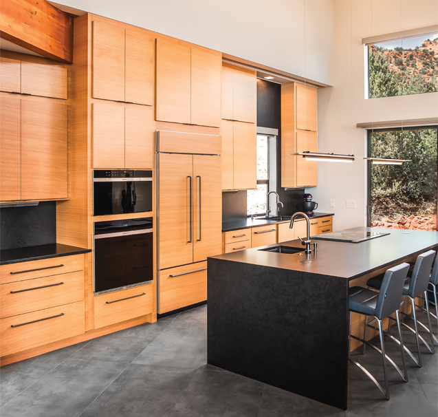
Photo 4
The Kitchen Of A New Build In West Sedona
The cabinets pictured in this kitchen in photo four are made out of rift white oak with a horizontal grain. The bottom cabinets are very large. The upper cabinets feature touch latches that are just underneath the cabinet doors. The base and upper cabinets have matching fixtures. In the upper left hand corner of the kitchen, a wood beam intersects with the cabinets. Leslie tells us that beam was difficult to work with. “The challenge is just to proportionally make it all look correct,” she says. Another difficulty? Ensuring the wood beam and the cabinet wood didn’t clash too much. The clients “didn’t want to match the beams exactly, but they still wanted a rich tone that wasn’t going to fight with the beams, that would complement one another,” she says. If you look closely enough, you’ll notice that the wood species on the waterfall-edge island is the same wood species in the cabinets. The floor is stained concrete, and the cabinets added some softness to the overall feel of the room, Leslie told us.
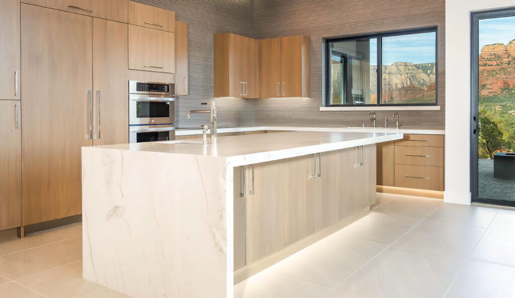
Photo 3
An Upgraded Kitchen Of A West Sedona Spec Home
The nine-foot cabinets that you see in photo three are made out of real rift white oak. In this specific type of wood, “the grain is a lot tighter, which lends to the contemporary vision,” says Leslie. Leslie also told us that grain matching was a challenge. The cabinets are not all made out of the same piece of wood but also needed to look coherent. The whole home was outfitted with these cabinets. “I think they go perfectly with the modern look that the builder and designer were going for, which is a flat slab,” says Leslie. The surfaces of the cabinets are flat, making them easier to clean than traditional shaker-style cabinets that typically have grooves. The large cabinets match the overall opulent feel of the spacious kitchen. “It’s luxurious, yet also practical,” says Leslie.
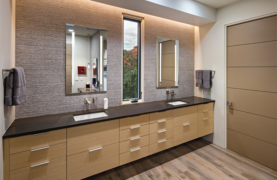
Photo 7
The Modern Kitchen And Bathroom Of A Remodeled Home In Central Sedona
The cabinets in the kitchen of this Central Sedona home in photo five and on the opening spread of this feature are made out of horizontal grain rift ash. “It’s not commonly used,” says Leslie of this type of wood. “They wanted it to be very light and airy. It’s a natural finish.” The owners were aiming for a contemporary look in their home. In this kitchen, the owners wanted to bring the outdoors in – a patio door opens nearby – with the natural wood of the cabinets and in the flooring, which is hickory. The cabinets “complement the flooring,” says Leslie. “The point is a little more wild. And so the cabinets are very unique, but they’re not fighting with the flooring. They’re blending, pulling out bits of the lighter portions of the flooring.” In the same house, the bathroom in photo seven of this Central Phoenix features a floating vanity – meaning the cabinets don’t touch the floor – with under lighting. “The floating vanity concept is something that is pretty popular right now,” says Leslie, also saying these cabinets have more of a luxe, resort feel to them than other options. “The only downside is, if you have a smaller space, you lose storage.” The cabinets in the kitchen and bathroom are the same. “It just flows throughout the whole home,” says Leslie. “So the consistency of just keeping the same concept going throughout the house.”
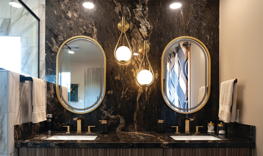
Photo 6
A Complete Main Bathroom Transformation
This main bathroom of a Village of Oak Creek home was completely transformed following an extensive renovation. The pre-existing bathroom in photo six was gutted entirely. The wall of the bedroom and closet was moved out by about a foot-and-half and created a much larger bathroom. Sedona-based Langstrand Contracting added new floors, new vanities and new pocket doors. The counter and the backsplash are both granite, which the owner selected. The gold in the granite also complements the gold in the Delta fixtures throughout the bathroom. The granite piece was so large that it was carried in through the roof and couldn’t be brought through the door. “I’m more partial to granite because it’s a natural stone. It’s got veins in it. It’s very unique,” says Chris Langstrand, president of Langstrand Contracting. “Quartz is all really kind of the same. I think granite is much more classy.” The shower is tiled with a brighter white porcelain from Arizona Tile as opposed to the granite countertops and dark cabinets. The window in the shower that literally added more light was a custom piece of glass the contractor created. “We went light on the shower, a little bit dark on the vanity. It all worked together,” says Chris. “I just think all the colors, everything went really well together. Even the way it’s laid out. It’s very functional, very roomy.”
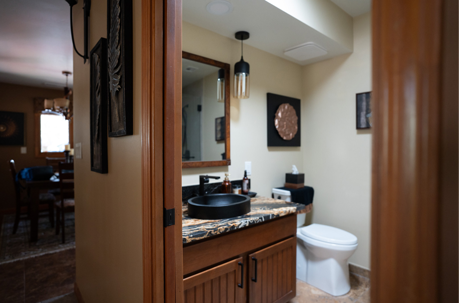
Photo 10
Langstrand also renovated a bathroom as seen in photo 10 in this same home. The toilet was replaced. The vanity stayed, but the granite vanity top, mirror and sink were replaced. The shower was also redone. A metal sink, lights, and a ceiling fan was added. All of the doors downstairs were changed to hardwood, shaker doors. “They gave the house a much more rich look,” says Chris. “The colors complemented really well. Even the granite, if you look at the stain on the cabinet, the granite complemented each other. She’s got the copper up on the wall.” Chris told us the design of the room largely revolved around the copper piece. Although not pictured, the shower was enlarged and made about a foot deeper. The shower features a glass door with tile on the walls and includes a decorative, porcelain tile stripe on the wall.
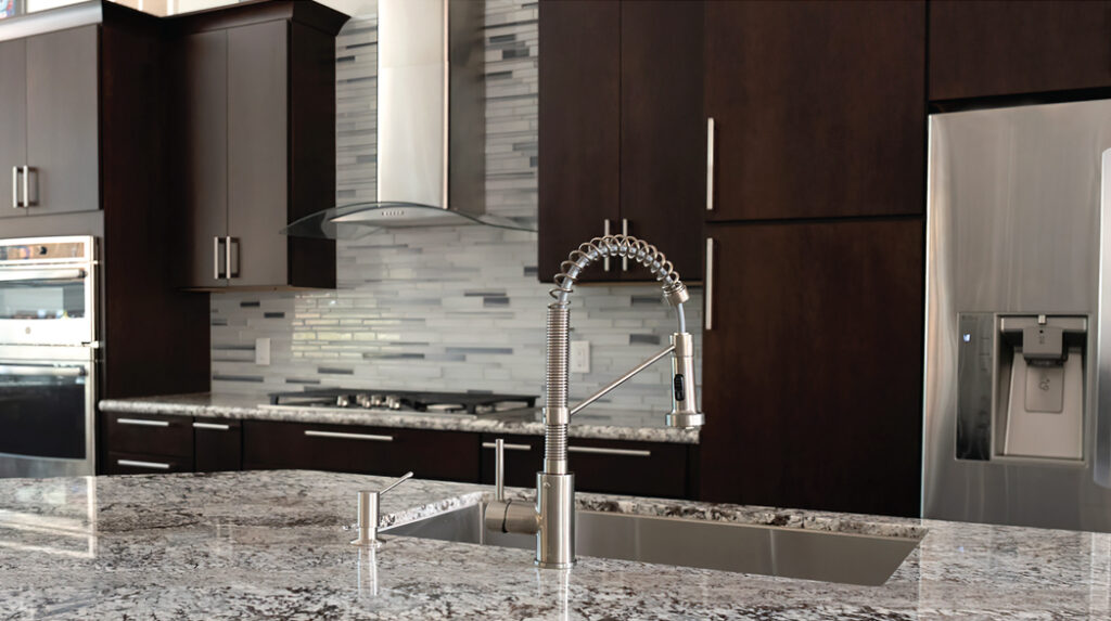
Photo 11
A Contemporary Kitchen In A Village Dwelling
There’s plenty of impressive amenities in this contemporary, spacious kitchen in photo 11 that’s in a home located in the Village of Oak Creek. “It’s a very sleek, modern look. It’s a very clean look,” says Chris. “We took all the walls down and made it look three times the size.” The backsplash is made out of glass tile, and the counters are granite. The kitchen is outfitted with Wellborn cabinets. A deep single-basin sink was installed in the spacious granite island. The back of the island is made of the same stone that was used to create the home’s fireplace. Langstrand Contracting also re-did all the floors, which are made out of porcelain. The wall behind the fridge was cut out so the fridge became counter-depth and didn’t stick out as far to save space. In the left hand corner of photo 11, you can see an area made out of the same granite as the counters and with room for barstools. It was built to serve as a desk. This kitchen is a mix of light and dark colors. “You have the stainless steel appliances, which go along with the backsplash and the hood. And then the countertop has got a lot of browns in it, which goes with the cabinets,” he says. “Whenever you design anything you want to take the door of the cabinet and then match it to the countertop, and you match to the tile and the backsplash tile. You want it all to tie in together.”
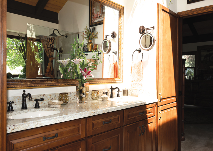
Photo 8
An Upgraded Bathroom In A Village Of Oak Creek Home
The owner wanted to upgrade this bathroom in photo eight. “She went with more of a traditional look with the raised panel doors,” says Chris. “The mirror was custom made with heavy moldings that were created by Langstrand. The shower tub combo was replaced with a door-less shower, making it handicap accessible. Lights were also added in the shower. Heated floors were also added. The counters are granite with an Ogee edge. The cabinets are made out of maple. Under the sink, the owner has pull out drawers to make it easier for her to grab her essentials. The door to the linen closet was made to match the cabinets.
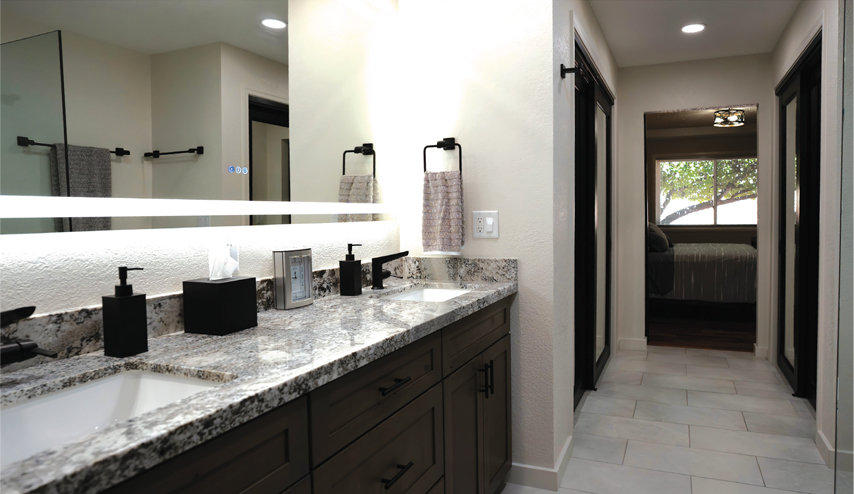
Photo 9
A Main Bathroom In A Village Home Gets A Modern Upgrade
Just off the main bedroom in a Village of Oak Creek home, this main bathroom in photo nine was completely changed. The vanity and shower were both enlarged. The contractor took a closet out and added a closet. Before, there two vanities – one in the front of the bathroom and another in the back. Chris and his team placed them side by side instead. Counters are granite. The bathroom features Delta fixtures. The craft-made cabinets are rusted alder wood with a grayish stain. Floor tiles are porcelain. The mirror from Ferguson Build is lighted and has fog control. The ceiling is outfitted canned LED lights. The shower is of some note. The clear glass shower is spacious, features a bench and is entirely glass – a trendy design feature. “People use a lot of clear glass now in the showers because you want to see the tile work, and it makes the bathroom look bigger,” says Chris.

