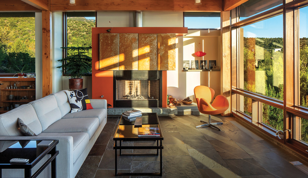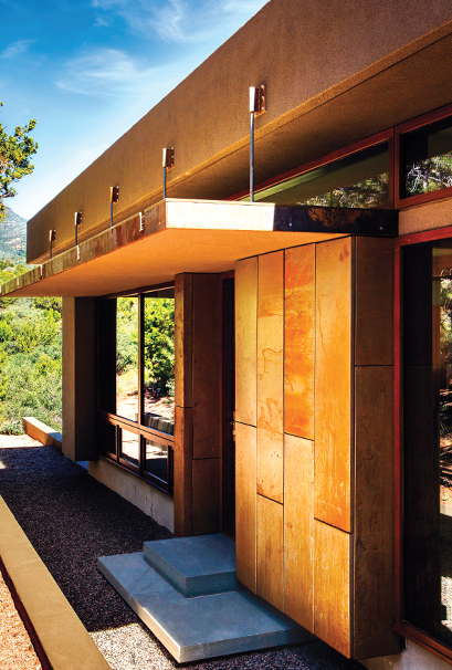
Weathered steel was used throughout the property. Photo by Jon Reis with Dede Hatch.
A Contemporary Cottonwood Estate
When Michael Szerbaty, AIA, an architect and principal of MDSzerbaty Associates Architecture’s wife was doing some work in Seattle, the couple frequently traveled to various Western destinations. One of their trips was to Sedona. “We were enamored with the variety of the landscape,” says Michael. “From the Verde Valley to the red rocks to the Mingus Mountains to Flagstaff and the pine forests. Just within an hour or so, the landscape changed so much.” They were searching for a horse property, and the couple eventually settled on an empty lot in the Quail Springs Ranch area south of Cottonwood in the Mingus foothills. It faces directly north to the Sedona red rocks and beyond to the San Francisco Peaks. The couple worked on the project together, and Michael designed it. The home was finished in 2015, and the property sits on 9.5 acres. They call the home Morning Sky House. The main home is 2,800 square feet and features two bedrooms and three bathrooms. The property also features a 750-square-foot guest house with horse stables. The first big challenge? The home sits on a steep, 18 percent grade.
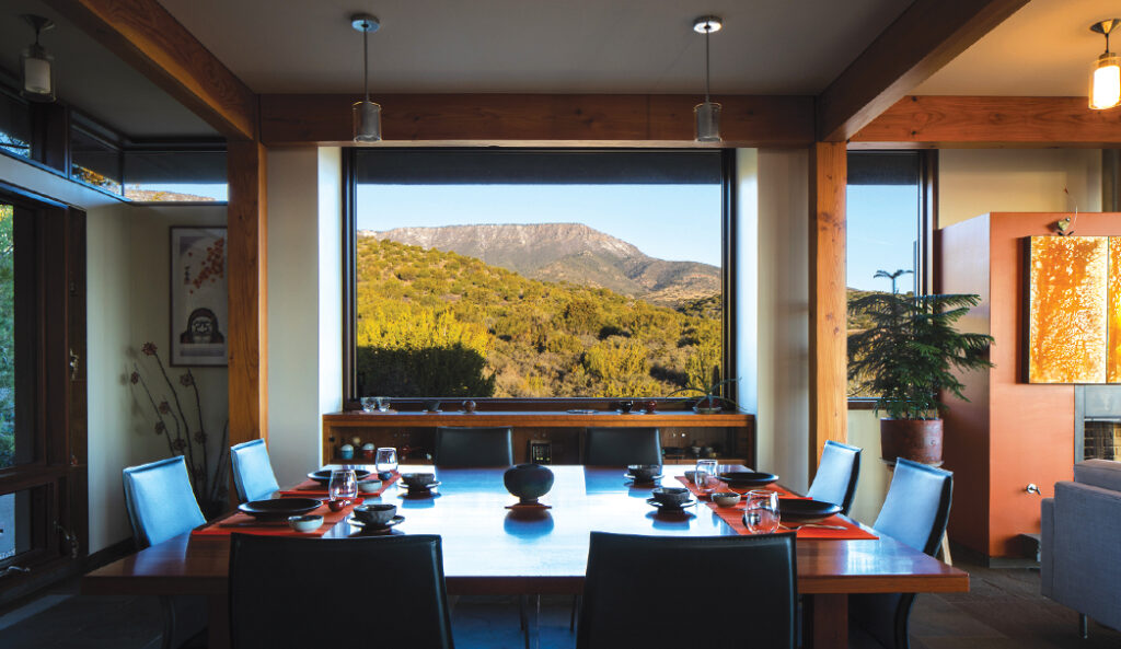
A stunning view from the dining room. Photo by Jon Reis with Dede Hatch.
“Coming down from the Southwest, we did a lot of looking at Native American ruins throughout, and I was always amazed at how they built ruins. And so that was a big inspiration to how to do this house. ‘How do I make it blend and disappear into the landscape and tuck it in?’ Once I started getting into thinking about the design of it, and how it worked and how to engage it with the landscape, it actually fell into place pretty easily. It kind of rises and falls with the landscape,” he says. One great example of how the home was made to blend into the environment is the use of weathered steel that’s found on panels in both the main and guest home. The rust-looking exterior of the material nearly matches the colors of Sedona’s red rocks. “The weathering steel that’s going to be allowed to rust on its own, take on that quality and continue to change over time, depending on the moisture and sunlight that causes that to happen. As it ages, it blends into the landscape more and more,” says Michael. “It’s evolved, and that’s one of the things that we really love about the house is this continual surprise of how it ages. As it ages, it blends into the landscape more and more.”
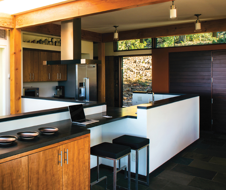
The kitchen features dark counters to contrast with the bright, natural light. Photo by Jon Reis with Dede Hatch.
The home – the exterior is pictured on the cover – also features plenty of glass windows that bring the outside in. The glass brings “openness, a complete connection with nature,” he says. Stepping inside the home, the kitchen, living room and dining room are all one open space. The kitchen’s counters are a dark gray speckled Corian to contrast with the bright sunlight. The Duratherm wood windows are from Vassalboro, Maine. The cabinets are cherry wood veneers that were made by Randy Plaff, as were the counters. The cabinet maker also constructed the dining room table out of the same wood used to make the wood floors. Randy Toogood of RG Toogood Construction was the builder. “Everything’s really very simple, but it’s how the materials come together and how they relate to one another. And ultimately, it relies on craftsmanship and the installation,” he says. Another standout space is the living room. You can see black steel surrounding the fireplace with a weathering steel mantle, Douglas fir posts and wood beams and a glass coffee table. An orange mid-century modern chair complements the orange behind the fireplace. We had to ask about how he managed to combine so many different design elements – glass, steel, wood and New York State bluestone tiles and hearth – into the living room without it feeling disjointed? Michael tells us that both the main and guest home were set up on a structural grid that ties all of the various elements together. “If you go through the house, you sense that rhythm, and that there’s a certain proportion to that space,” he says. “That really pulls everything together, a certain sense of the proportion of the spaces and how they relate to one another. That whole space is open. To the left is the dining space, but the column grid, the post and beam structure, is always giving you a sense of being in a certain zone.”
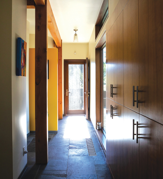
A hallway leads to a glass door. Glass was used frequently to bring the outside in. Photo by Jon Reis with Dede Hatch.
His wife, Janet Twyman, spends all her time in Cottonwood. Besides monthly trips to New York, Michael spends the vast majority of his time in their Verde Valley home too. “Now I spend most of the time with the house and riding our horses and tending to the ranch,” he says. The couple has finally created their dream home. “I’m an architect, and I have a practice. But this was a pet. This is your dream home. It’s your dream little project. And it’s disconnected from the rigors of an architecture firm, and we kind of found our spot and said, ‘This is where we want to be, and we want to have our horses. We want a nice house.’ And we went for it. It’s kind of living the dream,” says Michael.
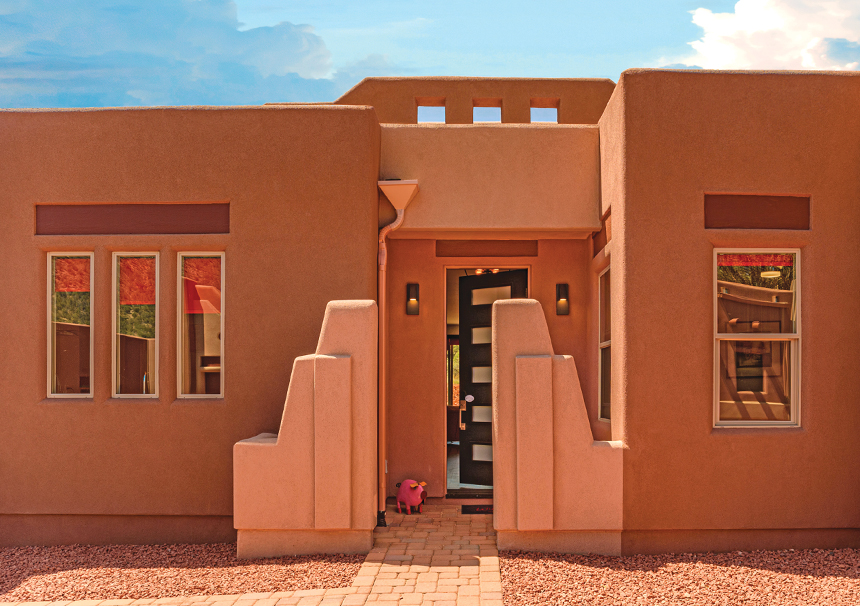
The home’s exterior. Photo by Sherry Bell, Architectural Photographer.
A Modern Home in the Village of Oak Creek
Cottonwood-based Hamman Custom Homes was already creating the framing for a spec home in the Village of Oak Creek when realtor with Russ Lyon Sotheby’s, Magdalena Romanska, decided she wanted that home to be her own. The exterior of the brand-new build had to match the exteriors of the surrounding homes due to HOA guidelines. The roughly 1,750-square-foot, three-bedroom and two-bath home was built in a Santa-Fe style. The exterior is synthetic stucco. “The exterior of the home absolutely blends in with Sedona and the remaining homes. We always tried to keep that in mind,” says Cally Hamman, a partner and a designer with Hamman Custom Homes When it came to the interiors, Cally had to accommodate Magdalena’s love of the color red throughout the space. “Her primary color throughout her home that was important to her was red,” says Cally.
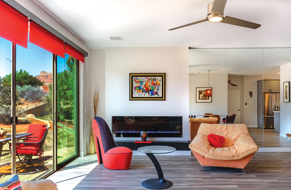
The home’s living room. Photo by Sherry Bell, Architectural Photographer.
“She really likes vibrant colors, and she likes to put her pieces out and her artwork up. So we kept that in mind. And she’s kind of a minimalist on what she needs so she’s able to use that space for her style and representing what she likes.” The front door of the home is even painted red. “It matches her personality,” says Cally. “An entry door is a statement.” To counterbalance the bold red, Cally also incorporated plenty of neutral colors – grays, whites and earthy browns – to ensure that everything flowed together. “We try to keep it really neutral so that when she put these kind of louder pieces in, those pieces we’re able to shine but still complement the surrounding part of her home,” says Cally.
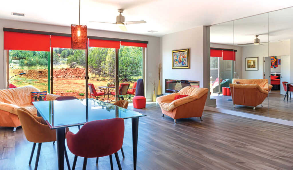
The living room of a modern Village of Oak Creek home. Photo by Sherry Bell, Architectural Photographer.
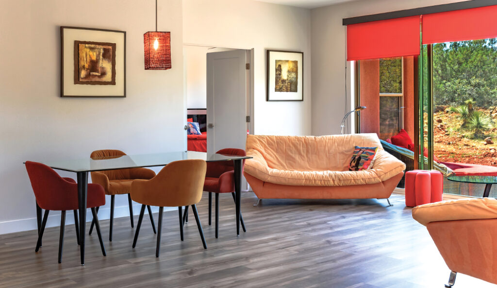
Red was one of the most dominant colors used in the home’s design. Photo by Sherry Bell, Architectural Photographer.
Like many homes in sunny Sedona, the home was built to capitalize on the state’s abundant sunshine. Especially in the living room. The back wall of the living room features two sliding glass doors that measure 16 feet total to make the most of the natural light. “We did maximize the natural lighting,” says Cally of the space. “A mirror wall was added to the living room to expand the room.” She explained that natural light reflects off of the expansive mirror wall and helps make the living room feel brighter. The open kitchen included floating shelves that were stained an earthy brown color to open up the space. A white quartz was installed by Innovation Granite in Prescott and used in the kitchen counters due to its timelessness (it’s light and doesn’t have a lot of design or detail, which makes it less likely to go out of style, says Cally) and durability. The gray cabinets were created by Northern Arizona Woodworking out of Prescott.
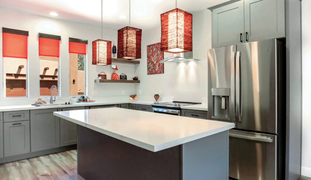
The home’s modern kitchen. Photo by Sherry Bell, Architectural Photographer.
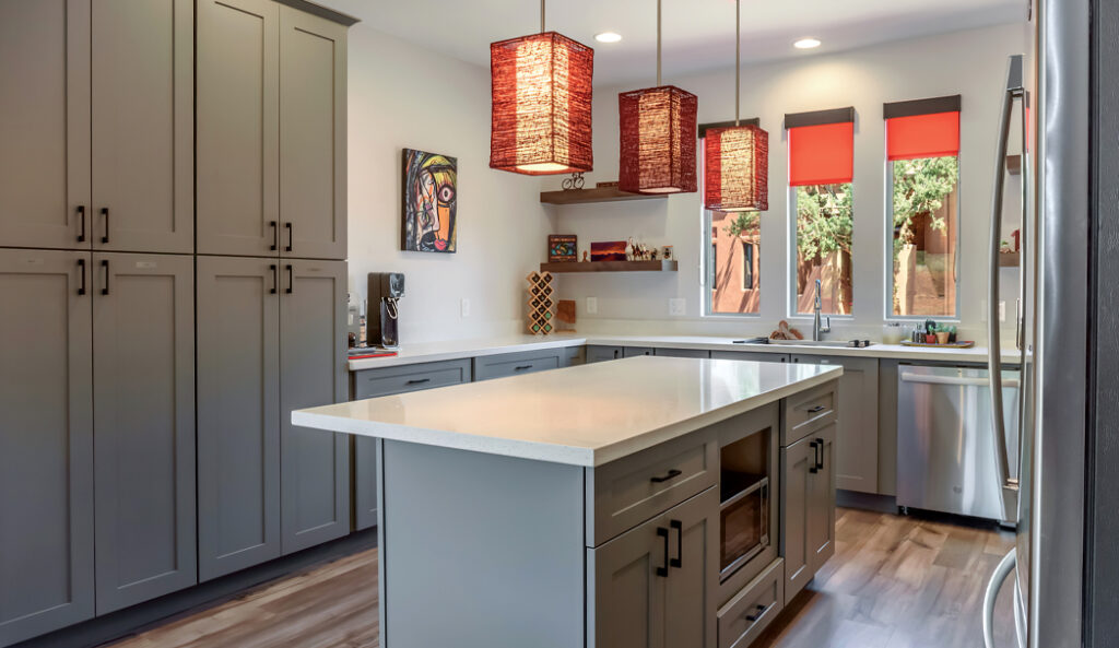
The kitchen was outfitted with white quartz counters and gray cabinets. Photo by Sherry Bell, Architectural Photographer.
With the exception of the primary bedroom, luxury vinyl plank flooring in an oak color was used throughout the property. “It’s really popular right now and rightfully so because it’s incredibly durable. It mimics natural wood,” says Cally. “The cool thing about luxury vinyl plank is that it is incredibly durable. It’s scratch resistant on the highest level.” Cally also prefers the material because it’s easy to clean and comes in a variety of colors. Like the rest of the home, the main bathroom and guest bathroom were both modern.
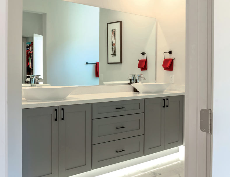
One of the home’s bathrooms. The bathrooms featured ceramic vessel sinks. Gray was used throughout the small space to create continuity. Photo by Sherry Bell, Architectural Photographer.
The main bathroom featured floor-to-ceiling tile. Marble was also used throughout. A small window and a skylight were also added to the main bathroom to let the light in. Plumbing was installed by D-Best Plumbing in Camp Verde. Cally used ceramic floating vanities in fun, geometric shapes with under-cabinet LED lighting. Gray was used as the wall color. Gray is also found in the cabinets in the kitchen and bathroom. Neutral colors used throughout help create a cohesive flow in the home. “It’s nice to carry the same thing throughout since it makes it feel more open and not broken up or choppy,” says Cally. “It’s just a really pretty, clean vibrant look that’s also timeless, never goes out of style.” Overall, the smaller home featured no unused space and had a distinctly personal feel to it.
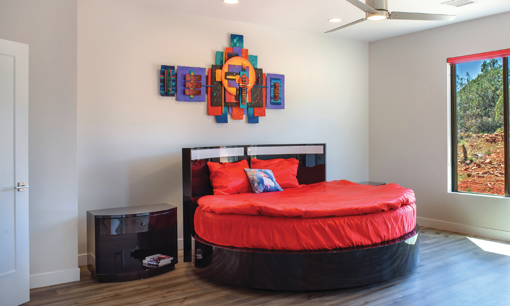
The home’s main bedroom. Photo by Sherry Bell, Architectural Photographer.
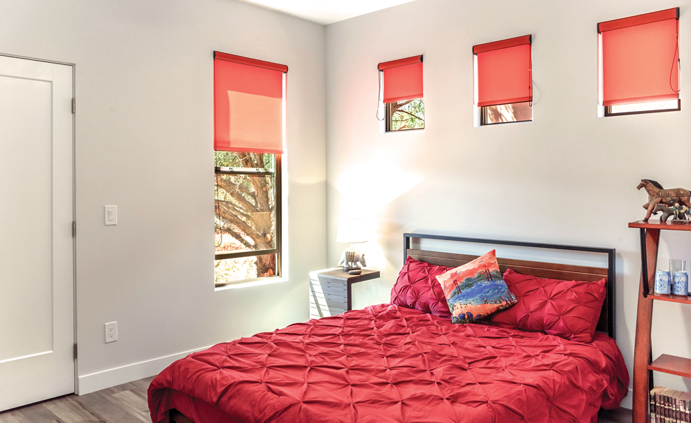
The home’s guest bedroom. Photo by Sherry Bell, Architectural Photographer.
“What I love about Magdalena’s space is the layout is very functional. What I love about smaller spaces is that it’s important to maximize space,” says Cally. “More than anything, I love that it wasn’t like a cookie-cutter home. [Magdalena] had her own taste and her own touch.”

